 A change of scenery is sometimes a good idea, if only to see things from a different perspective!
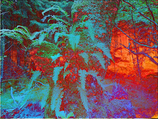
Here's a part of a forest in Scotland which was taken on holiday last year and this is what I did with it (Background layer at bottom of stack) -
Copy 2 lighten 28
Sunset sky difference 100
red circular gradient difference 34
Copy 1 screen 92
Background photo
Increased saturation after merging
Hope you are all having a good weekend!

Love the way you have changed the perspective but I think I prefer to walk through the first forest Jackie in Surrey, UK. ☺
ReplyDeleteThis is great Julia, the ferns really pop in your digital interpretation and of course I love all the colors. xox Corrine
ReplyDeleteI,m impressed ....
ReplyDeleteCertainly brightens your photo up, nice colour
ReplyDeleteI wish I could take lessons from you! Do you do this in photoshop?
ReplyDeleteyou know I love those colors!
ReplyDeleteDo you think I could have some increased saturation, please?
I've just started doing Kim Klassen's mini-ecourse online to start learning photoshop elements. I hope some day your recipes for these awesome techniques will make sense to me. As always AWESOME! Do you ever have your images printed and framed or how about printed on canvas? You have some real masterpieces!
ReplyDeleteI love what you do with your photography, is it photoshop? I would love to learn how to do it, do you know of any courses? Great inspiration for textiles Julia.
ReplyDeleteWow, the pictures are exciting! The second has such vibrant colors! Cathy
ReplyDeleteWhat you have done with the photo is gorgeous. And your journal in the previous post is fabulous. Your colors are very lively and inspiring.
ReplyDeleteI love how you work with photoshop....this is so wonderful.
ReplyDeleteThanks for the info ... I have Elements 6 but not PSP. I have tried one of Kim's mini-courses but I think I need to take one of the more detailed ones. Plus ... you seem to have a real gift for this.
ReplyDeleteNice effects Julia - looks like there's a fire burning in the underbrush !
ReplyDelete